Let’s be honest, when was the last time you opened a website on your laptop instead of your phone?
Exactly. Most of us reach for our phones first, whether we’re searching for a new café, ordering groceries, or checking out reviews for that cool gadget we saw on Instagram.
In 2025, your customers are doing the same: browsing, clicking, and buying right from their phones. So if your website doesn’t look good or work smoothly on mobile, chances are they’ll move on… probably to your competitor.
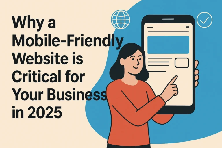
This is exactly why having a mobile-friendly website isn’t just important anymore; it’s essential for your business.
Let’s break it down in simple terms so you know exactly what it means and why it matters so much.
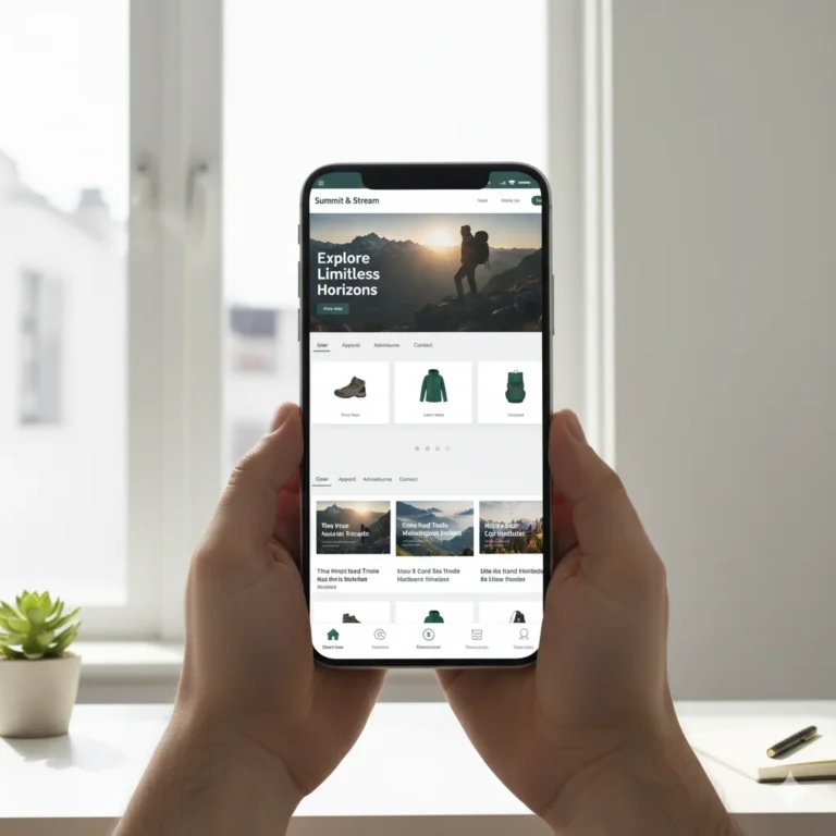
When we say a website is mobile-friendly, we don’t just mean that it “opens” on a phone.
We mean that it:
– Loads quickly (no one waits more than 3 seconds now)
– Looks clean and clear on all screen sizes
– Has readable text without zooming in
– Has buttons that are easy to tap
– Doesn’t have annoying pop-ups or elements blocking the screen
– Feels smooth and easy to navigate
In short, a mobile-friendly site makes it super easy for someone on their phone to find what they’re looking for, without feeling frustrated.
If your site isn’t mobile-friendly, Google might not even show it in search results. That’s because Google now uses your mobile site version to decide where you rank. No mobile optimisation = lower visibility.
People are impatient online — especially on mobile. If your site takes too long to load or is difficult to navigate, they’ll just hit back and leave. It’s that simple.
With voice assistants like Siri and Google Assistant becoming smarter, your mobile site needs to be structured properly to get picked up in voice search results.

Alright, so what do you actually get out of having a mobile-optimised website? A lot, actually:
Google loves websites that are mobile-friendly. That means you’re more likely to show up when people search for your product or service.
People will stick around longer and explore your site if it works well on mobile. And that’s always good for business.
A user-friendly mobile site makes it easier for people to take action — whether it’s calling you, booking a service, or making a purchase.
In places like India, a huge chunk of the population is mobile-first or mobile-only. If your site isn’t built for mobile, you’re missing out on a huge audience.
A clean, fast, mobile-optimised site shows that you care about your customers — and that builds trust.

Let’s say you run a café in Mumbai, a clothing brand in Delhi, or you’re offering online courses across India. No matter your industry, your first impression happens online, and usually on a phone.
If your site loads slowly, has text that’s too small, or the layout is all over the place… your visitors might think you’re not serious about your business. That’s harsh, but it’s true.
In 2025, you don’t just need a website; you need one that feels good on mobile. That’s how you keep people coming back, referring you, and trusting your brand.
Here are some tools that can help make your website mobile-ready:
Just pop in your website link, and it’ll tell you if your site is mobile-friendly — plus what to fix.
Helps you check how fast your site loads on mobile and gives tips to improve it.
Great for running in-depth site audits and spotting mobile-related SEO issues.
A detailed speed testing tool that also gives you performance grades for mobile.
These show you how people actually use your site on mobile — where they click, scroll, and where they get stuck.
Design for the phone first, then scale up for larger screens. This way, the important stuff is always front and centre.
Don’t clutter the screen. Use white space, simple menus, and clear calls-to-action (like “Call Now” or “Book Appointment”).
Your buttons, links, and menus should be finger-friendly. No one likes zooming in and hunting for the right spot to click.
Choose clean fonts and make sure the text size is large enough for mobile screens.
Compress your images, limit unnecessary animations, and keep your website light. People hate waiting.
Open your site on different phones; Android, iPhone, older models — and see what’s working and what’s not.
We get it, building or fixing a website can feel overwhelming. But that’s where Digital Vigyapan steps in.
We’re not just another digital agency in Mumbai. We’re a team of tech geeks, designers, SEO specialists, and creatives who live and breathe the mobile-first mindset.
At Digital Vigyapan, we help businesses like yours create stunning, responsive websites that work like a charm on mobile and convert visitors into loyal customers.
We also have a 1500 sqft studio packed with tools to help you with videos, branding, content creation, and more.
So, whether you’re building your first website or want to give your current one a serious upgrade, we’ve got you covered.
Let’s build a mobile-first website that your customers (and Google) will love.
Get in touch with Digital Vigyapan now
We mix creativity with algorithms, blend strategy with storytelling, and turn digital chaos into brand success, welcome to Digital Vigyapan, where marketing meets innovation!
We mix creativity with algorithms, blend strategy with storytelling, and turn digital chaos into brand success, welcome to Digital Vigyapan, where marketing meets innovation!
Copyright © 2025 by Digital Vigyapan. All Rights Reserved.